When designing a cover for your book, how do you decide which font and what text colour and size you’re going to use? Where should I place my text? What colours should I use in my image? I’m in the middle of this process and still learning.
So far I’ve created hundreds of different combinations for this cover and still can’t decide which to use. I’ve narrowed the choice down to eight and sincerely hope some of my followers can help me choose. Sorry I can’t make the images small so you can view them all together.
The cover is for a murder/suspense novel. I really need your input on these. Maybe none of them are suitable like the previous one I posted. I deliberately made the text bright so it would show up in thumbnail size.

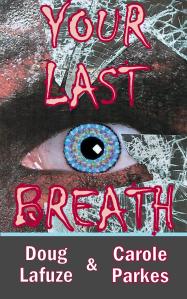
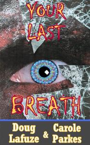
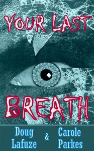

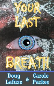
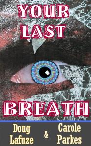
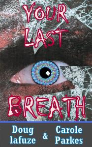

It’s between the second and the last one. Hope that helps. Choosing the right cover is tough work.
LikeLike
Carole
First, YAY that you are at the stage of choosing ypur cover art! 🙂 I like the first and the fourth example.
Such an exciting dilemma 🙂
LikeLike
Thanks, Kathleen, I value your input. That makes four for the first one and three for the third image. 🙂
LikeLiked by 1 person
Reblogged this on Books and More.
LikeLike
Thanks for your participation, Courtney. Did you receive the book I sent you by email?
LikeLike
Sorry, it took me a bit to get back to you. I can’t seem to find one in my email. Did you send it to the right email? Charlie.s_Angel-0069@hotamil.com. I know some have missed the underscore between the s and Angel because it gets highlighted and lost.
LikeLike
Reblogged this on sjparkes30 (Caitlinallycesmum).
LikeLike
Thank you, Sue. Hopefully, the helpful people responding will help me decide.
LikeLike
I prefer the second on the left.
LikeLike
That’s the grey one then?
LikeLike
Yes x
LikeLike
I agree with “My Crazy Life”. I like 1 and 3 the best, and think you should just use red instead of two colors.
LikeLike
Thank you, Beth. It’s a close between those two up to now.
LikeLiked by 1 person
Never use more than two fonts in two sizes and keep them dimple. Use aria, for your names. It is easy to read. Your font sizes are good. I find the title font hard to read when you use Two colors. Yellow is hard to read. Cover three us the best. Dulled out background. Make title font all red so it pops out at you. USSR plain Arial font for author names.
Look at covers you like and determine what you like about them. Simple is better..
Want a laugh? Read my blog. http://www.amysigns.wordpress.com
>
LikeLike
Thank you, for your informative input, it’s appreciated.
LikeLike
You’ve given me some helpful advice, thank you. I read on someone else’s cover advice you should never use the standard Word or Microsoft fonts and that it’s worth buying the more exclusive ones. Are you disagreeing with that advice?
LikeLike
Love the first.
LikeLike
It’s great to know there are a few people who like the first, thank you for your input.
LikeLike
They are all too busy. Prefer second down on the left.
LikeLike
It appears that others like it too. This is so funny because out of all the ones I created, I pushed the plain ones on the back burner right away as being uninteresting. These were the ones with single colour, plain text and no shadowing. It looks like I’ll have to dig them out. It’s a good job I didn’t delete them, ha ha.
LikeLiked by 1 person
For me, it has to be the first cover Carole. The white of the eye looks pinker, the font is ragged and uneven (like a last gasp) and the colours just seem right as well
LikeLike
Thanks for your contribution, Edwina. Going on the advice coming in about simplicity, I guess the first one is plainer compared to the others, but not quite as plain as 3.
LikeLiked by 1 person