
Some of you, in the replies to my previous post, suggested the images I gave you were all too busy, too colourful, and not plain enough. I’ve taken these lessons to heart, and I’ve created some plainer book covers for my co-authored crime/suspense book. I do still think the plain red text doesn’t show up very well on the one eye version, and that’s why I originally discounted it. Here are 6 new designs based on your replies. Please look at them and tell me which you prefer. The two most liked images from the previous batch (numbers 7 and 8) are included here to make the total eight. Hopefully, the decision can be finalized this time.
I should add that the white border isn’t on the actual cover, it’s just something my WordPress theme is doing.

Image 1

Image 2

Image 3

Image 4

Image 5
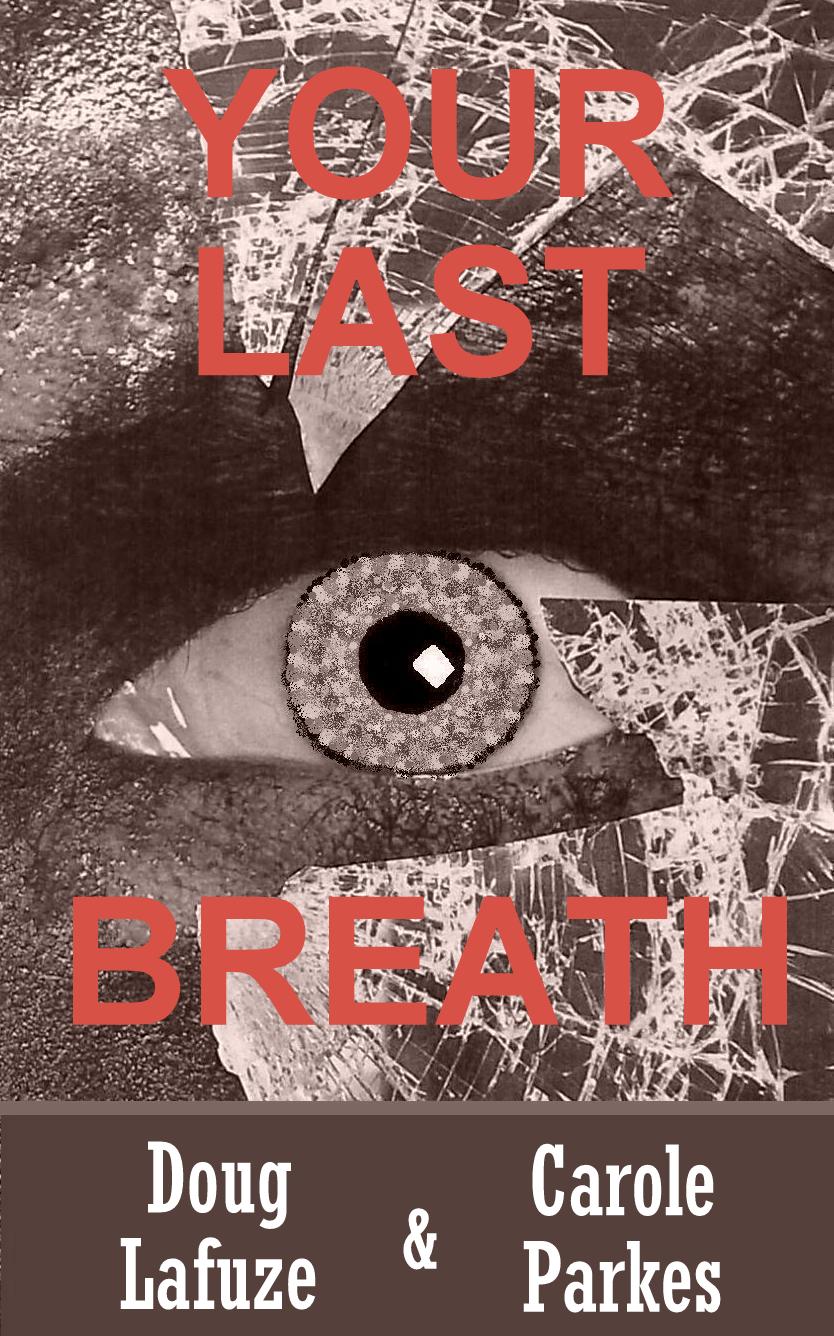
Image 6

Image 7

Image 8


1 or 7 for me.
LikeLike
Thank you, they do seem to be favourites.
LikeLike
I also like #1. Simple, striking and chilling.
LikeLike
Thank you, another vote for one. Your input is highly valued. Your covers for ‘In the Genes’ and ‘Mr Perfect’ are amazing.
LikeLike
I’m partial to number one. It grabbed my attention when I first saw it. If you want more color and not the white then I think number 8.
LikeLike
Well, it does seem to be number one. Thank you, for participating.
LikeLike
No problem
LikeLike
I find image 8 the most chilling but image 1 the least crowded although less chilling
LikeLike
Thank you, firstly for commenting and helping my dilemma, and secondly, for being another regular active reader of my posts. It hasn’t gone unnoticed.
LikeLiked by 1 person
Definitely 7!
LikeLike
Thanks for commenting, and thanks for your active support over a long time. It’s appreciated.
LikeLiked by 1 person
Number two, but use red, not white letters.
Want a laugh? Read my blog. http://www.amysigns.wordpress.com
>
LikeLike
Thank you! Your contribution is appreciated. You do have a funny site.
LikeLike
I like the first one. Good luck.
LikeLike
Thank you, Helen. Your contribution is appreciated.
LikeLike
Hi Carole
I’m still liking number 7 🙂 I hope this helps.
LikeLike
Thanks Kathleen, duly noted. This one seems to be favourite so far.
LikeLike
I vote for image 3, Carole.
LikeLike
Thanks, Marian. I really need all the help I can get with this.
LikeLike
Image 2 and 5 are the best looking.
LikeLike
Thank you, for taking the time to look and comment here. I need all the help I can get!
LikeLiked by 1 person
#6-with the red lettering.
LikeLike
Thanks for your contribution. Now I can return the favour and pop over to see your website and all the other’s too.
LikeLiked by 1 person
The first one.
LikeLike
Thank you, Richard. It’s so helpful of you to respond with your answer. Have a great day!
LikeLiked by 1 person
Welcome 🙂
LikeLiked by 1 person
I like image #7. It pops but doesn’t overwhelm you when you look at it. have a blessed day.
Shirley
LikeLike
Thank you so much, Shirley. This one seems to be the favourite so far. Blessings returned ten fold. 🙂
LikeLike
7 or 5, I’d say – depending on the general pace and or severity. I hope you find the ideal cover with our ‘help’, Carole.
LikeLike
Thank you, for your participation, Karen. Which of those most hints at ‘severity’ in your eyes? This is about a serial killer and some of the murder descriptions are quite graphic.
LikeLiked by 1 person
#5 for thriller, #7 for horror (thriller). According to your explanation, my choice is #5, Carole.
LikeLike
Image 1 is the least complex and difficult for the eye, and image 2 is the second least difficult. I like the first one better because it is more modern compared to image 7’s 70s style.
LikeLike
Hey! Number 7 suits my age then, ha ha. Thank you for your thoughtful contribution.
LikeLike
Red on brown (6) doesn’t work, plus, you might want to consider people who are colour blind where certain shades of red and green just look grey.
My preference now is for the first one. It’s very clear and simple, especially the font.
Incidentally, I wish you and Doug much success with it.
LikeLike
With all the help you wonderful people are supplying, we’ll do our best. The first one was the image I most preferred, but it was in landscape form and I thought it wouldn’t suit the portrait style of a book cover. I could have saved myself some time if I’d just gone with my instinct. I’m grateful for your knowledge and participation.
LikeLiked by 1 person
Image 7 is my fav..
LikeLike
Thank you, for participating and also for being so swift with your reply.
LikeLike
Thank you for getting involved with my dilemma, I’m most grateful!
LikeLike